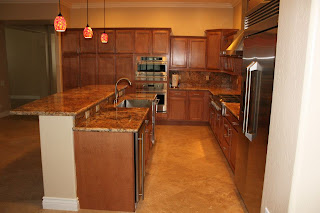
This is a remodel my cousin did. I had to show it because it is amazing. This is done in Las Vegas. If anyone in the Las Vegas area needs some work done before sure to contact Michael Richards.
Before:

The Plan:
After:


The entire remodel is just stunning. But I actually wanted to focus on this. I was looking at model homes in Arizona last month and I noticed almost all of them had these entry ways that weren't a part of any other room in the house. In my current house you open the door and walk straight into the living room. So I picked a house that I wanted to buy and it had an entry way similar to this one. I tried to figure out how to decorate it and was having a hard time. It is a separate room, and yet a part of the front of the house. So how do I give a feeling of separation while also making it flow with the rest of the house?
There isn't much room for furniture, I don't want to put up a whole lot of artwork in the small space but I wanted it to have a decoration of some kind that would make it feel like it's own space.
This is a picture of the house I want:
The second garage on the left is actually a Casita, or "Mother in law suite," that I plan to use for my work space. The entry way is similar to the one in Michael's remodel except it is rectangular. I definitely plan to do something like what Michael added to the entry way. I love the dark and bold colors. They are eye catching and the pattern is very attractive.
It reminds of Suzani:
Too cool.


No comments:
Post a Comment